Production Task 1: Photography

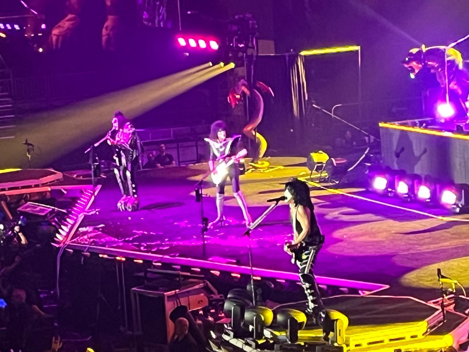
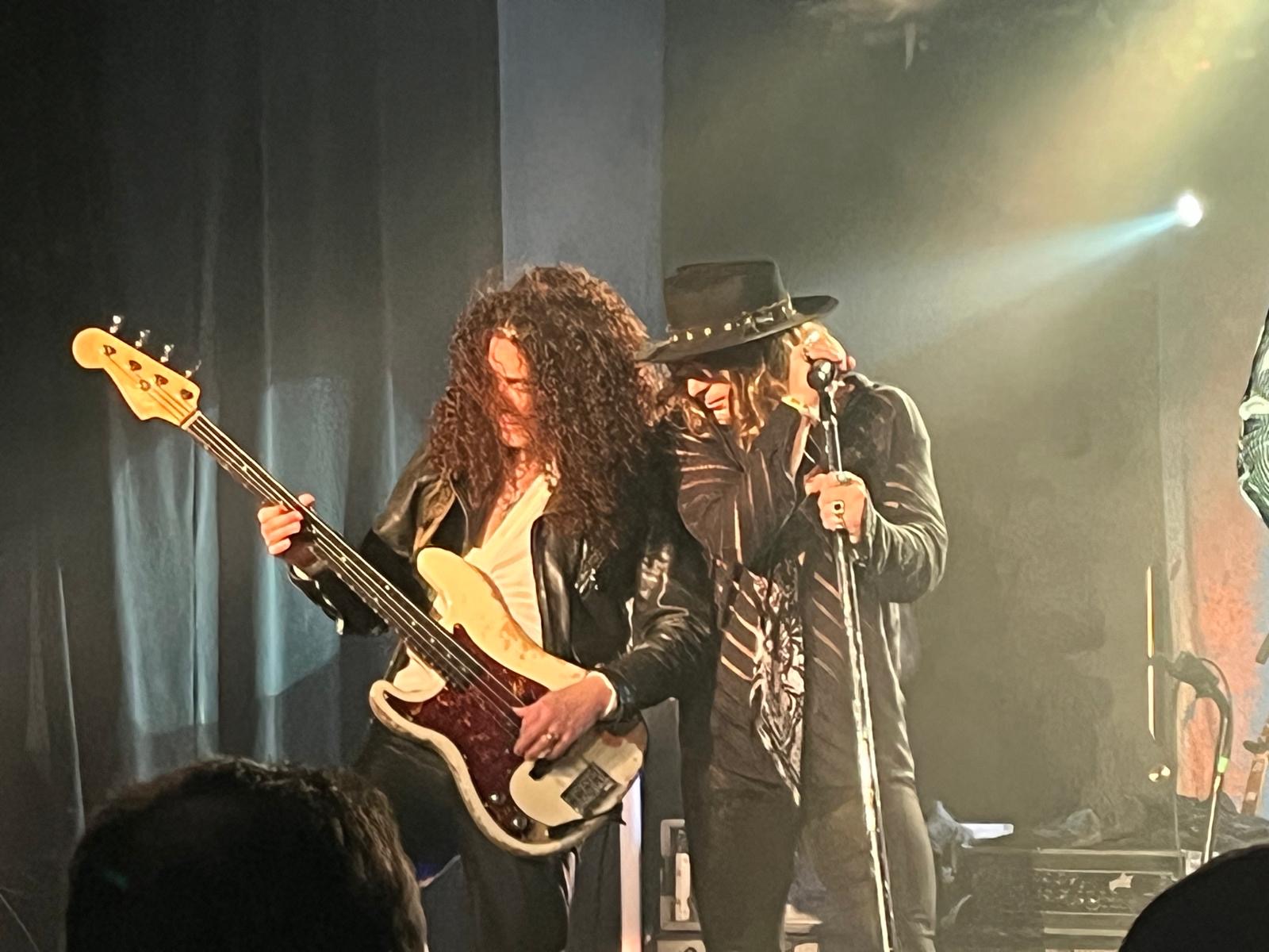
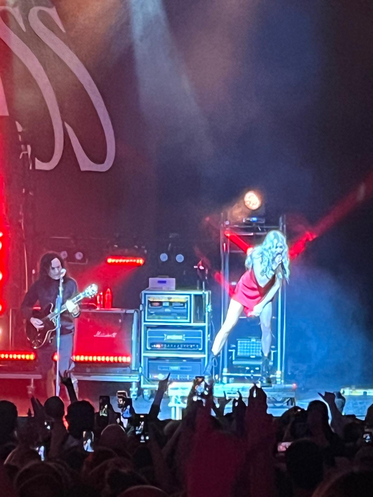
 For this task I used a selection of photographs from various concerts I have attended over the past few years. Enjoy!!!

The Pretty Reckless


KISS: Live at the Birmingham NEC


Other artists!


Photoshoots


The editing on these photos are a result of more precise background removal in the Ibispaint digital editing and illustration program!


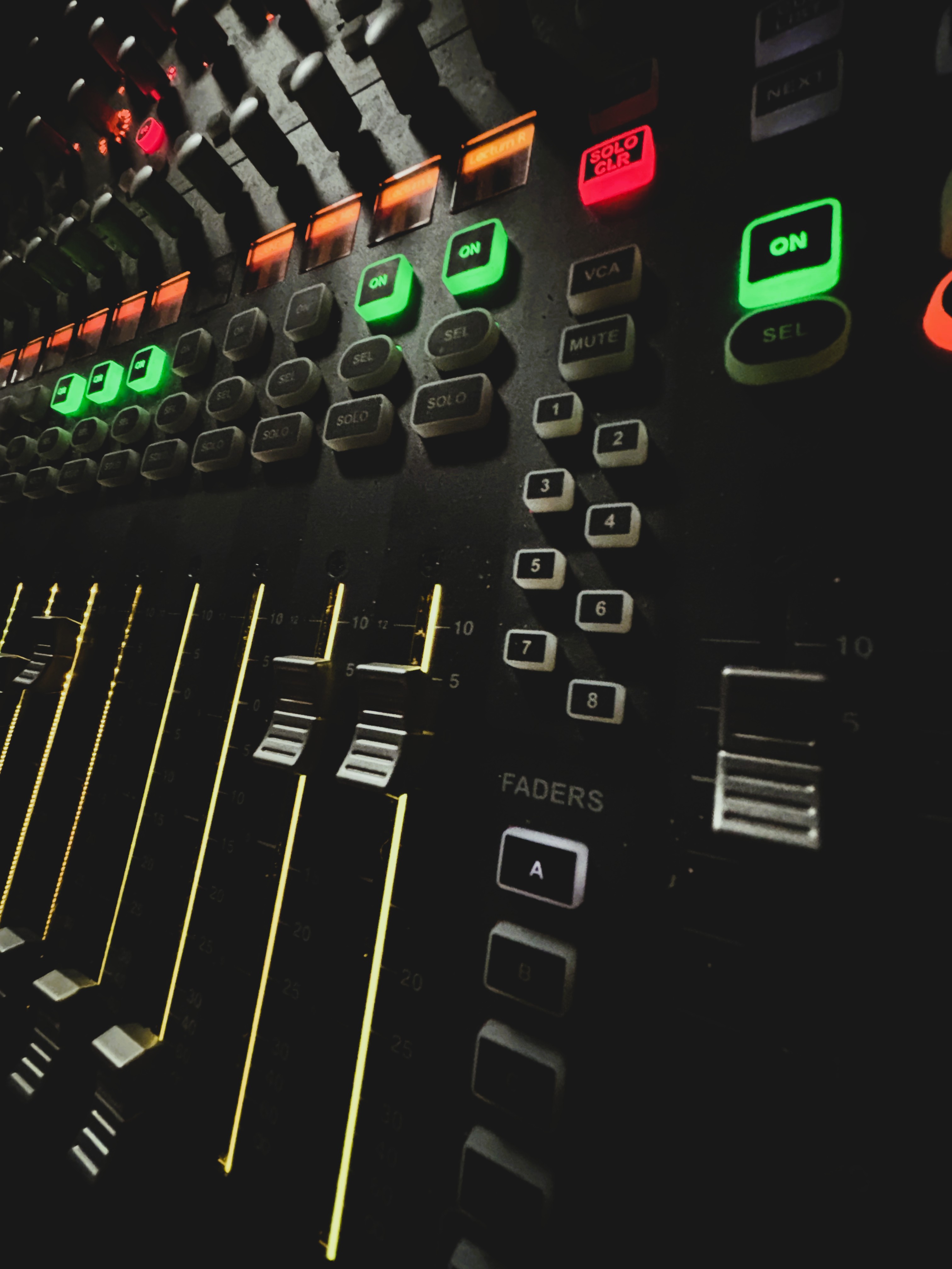
Soundboard & Equipment


Planning Task 6: Contents Pages planning & research


I finally settled on Alt Parader as my masthead as a tribute to the Hit Parader magazine, which back in the 70s/80s was the epitome of cool in the magazine format.

Planning Task 4 & 5 : Front Cover Design & Mock-Up


This is my plan for cover 1 (edition 2) of my magazine :)
I really want my covers to be packed with cool visuals that flow together nicely with contrasting colours, bold fonts and emphasis on the main headlines. On Cover 2 (edition 1) i plan to use a similar design to create a desired house-style, except with different information relating to October releases and a photograph of another model.

Planning Task 3 : Masthead Design


For the design of my Masthead I want to use an edgy, retro aesthetic. I have chosen a variety of brash and punky fonts to experiment with on my magazine issues and the website. Almost right away I had the idea of choosing a font similar to the sex pistols' 'God save the Queen' album from 1977 since I believe the font looked awesome and grungy. 

I had the idea of splitting the masthead and strapline between two fonts to establish better contrast and to draw the attention of the reader to each respective line separately. Eventually I settled with the 'Times New York' font for my strapline (Tear up the Scene). I think the font encapsulates quite well the darker and edgier aesthetic!


My masthead 'Alt Parader' needs a strong, retro style font in homage to the 70s/80s music magazines I used extensively for inspiration in the planning process thus far. The thickness of the font is also important since I want to colour my masthead in a vibrant tone that creates a stark contrast point between the text and imagery, defining it clearly for the reader at all times. I chose to use the 'Bandito' font for my masthead since it fits the desired description above. I think the font looks memorable and fits the retro aesthetic quite well.


Similarly to my front covers, for the contents pages i plan to use a variety of fonts that provide the magazine with a unique style that helps it stand out. 


Planning Task One : Magazine Title and Strapline


Research Task Nine : Target Audience Research And Analysis

 Music magazines traditionally provide content to a wide variation of audiences and genres, although each magazine needs to know the characteristics between which audiences are most likely to purchase their magazine and recommend it to a wider audience. It is vital for magazine companies to understand their audience demographics, as it helps them with editing, publishing and receiving feedback for future releases. For this task, I created and published a survey out to a number of young people from varying age ranges (within the 16 - 25 range) in order to gain a better grasp on how varying audiences perceive music magazines in the modern age. This survey was created in a simple 10 question format, providing general information such as age, gender, music taste and perceptions of music magazines; which helped with my understanding of how involved young people are with the music scene in the modern media climate.

I distributed my survey to a varied audience of both friends, family and acquaintances within the intended age bracket. This allowed me to gain varying results from a larger source of people. For the results themselves, they varied rather considerably in the general reception of music and magazines. The majority of my audience was within the 16 - 18 age range, which swayed many of the results to what is most popular to the younger areas of the chosen demographic. 


The Gender of participants in the survey was quite equally split, allowing for my results to show the appeals and preferences from an audience including all inclusive genders.


The chosen genres of each participant leaned significantly towards Rock n Roll as the most popular form of music, although specified material included grunge, hip hop and Opera.    


The results of the survey show few people in the younger age bracket purchase music magazines. This reflects the overall decline of physical print magazines over online media formats.


The  relatively small amount of visits to a music magazine website shows the importance off engaging a younger audience of young adults and teens. I plan to add a mixture of engagement and exciting visuals to achieve a mood and tone attractive to my target audience.


Feedback from the survey on what to include in my magazine will help me see what is most desired in a music magazine, and what most would help make my magazine a better success for the younger mature audiences.
Reflection Point : What Have I Learned About Independent Music Magazine Websites?

 Independent Music Magazine websites are utilised by a multitude of publication companies, both new and traditionally print-oriented publishers. These magazine websites have become a relative necessity in the past decade as news, information and entertainment has largely transitioned to the online plain with the introduction and widespread takeover of online media. Subsequently, a majority of print-magazine companies have needed to introduce their own digital publication formats to retain both relevancy and financial buoyancy in recent years. The publishers themselves commonly retain the print-magazine format as their primary focus of advertising and publicity, with their newest issues/back catalogue heavily publicised throughout their websites to garner further attention and likelihood of public intrigue in purchasing their magazines. For many publishers, magazine websites have taken prescience in their financial ethic, as sponsorships and advertisement deals have taken a large role in providing both finance and publicity to the websites. Sometimes this publication of external advertisements has overtaken the publication of the magazine itself in relevancy, showing the development in some companies from a primarily print-based focus, to an almost entirely digital focus.

The designs and contents of independent music magazine websites varies greatly from publisher to publisher, as each individual website utilises a mostly unique aesthetic that often personifies the thoughts and motives of each publisher. For example, certain websites/ magazines follow a defined 'house aesthetic' akin to the designs of their print-publications. The usage of a house design helps to maintain individuality between each website, and help attract targeted audiences through the website layout, colour palette and content showcased on the homepage and beyond. An example of a maintained house aesthetic is with the 'So Young' magazine, which uses a vintage aesthetic throughout its publications (both print and online) in order to appeal to an audience interested and attracted to magazine design/ music made famous in the 1970s/80s. Meanwhile, some other publishers such as Shindig focus primarily on a more modern take of website presentation, which would appeal more so to its futuristic and hip audience over more classical audiences.

  Dear Moderator,  My name is Ashley Evans and welcome to my A Level Media Studies blog. This is a record of the work I have undertaken for ...